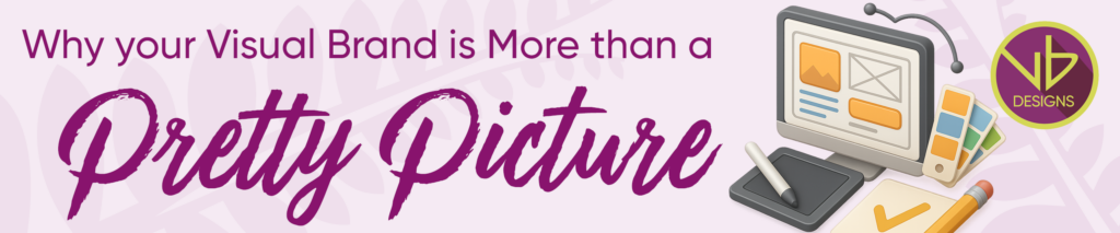
Why Your Visual Brand Is More Than a Pretty Picture
Blink and you’ll miss it, literally. With an average attention span of just 8.25 seconds, and only one-tenth of a second to make a first impression, your brand doesn’t get a second chance at “wow.”
That’s where good graphic design earns its stripes. I like to compare a business’ visual brand to a handshake, they both need to feel confident, consistent, and authentic. So how do you do that?
It’s All About the Experience
Graphic design isn’t just about aesthetics, it’s about the experience. Every interaction your audience has with your brand, from your website and socials to your business cards, brochures and flyers should spark a feeling: “They get me.” That emotional connection builds trust and trust builds loyalty, which is what keeps customers coming back (and referring you to others).
Images & Storytelling
Every image should tell your story and represent your audience. Authentic visuals help people see themselves in your brand. Remember design isn’t decoration; it’s communication.
A Little Help from AI
AI isn’t here to replace your creativity, it’s here to enhance it. From generating graphic design ideas to testing colour palettes or predicting user behaviour, AI tools can help you create smarter, more targeted visuals. Think of it as a creative assistant, not a graphic design replacement.
Keep It Consistent
Consistency is the glue that holds your brand together. When your website looks one way, your stand at an expo another, and your printed collateral something else entirely, it creates confusion. Confused customers don’t buy. Cohesive design builds recognition and credibility. Research shows brands with strong visual consistency are 3.5 times more likely to have strong brand visibility.
Fonts, Colours & Vibes
Fonts and colours speak before you do. Serif fonts feel classic and trustworthy, sans serif feels modern and bold, and more decorative styles can express personality, just don’t overdo it. Keep text readable and uncluttered, ALWAYS.
Colour psychology plays a big role too. For example, blue can builds trust, green represents wellness, red sparks passion, yellow radiates happiness. Choose a palette that reflects your brand’s personality.
Design With Purpose – A Design Self-Audit
Before starting any project, ask: “What experience do I want to create?” Purpose-driven design isn’t just memorable, it moves people to act.
Here’s a quick design audit to test your brand’s visibility:
• Are your colours consistent across all platforms?
• Do your fonts reflect your brand’s personality?
• Would people recognise your brand without your name on it?
If you hesitated on any of those, your design might be holding you back. In a world that decides in less than a second, ensure your brand makes a lasting impression.